Google Coursera Project
24/7
Overview
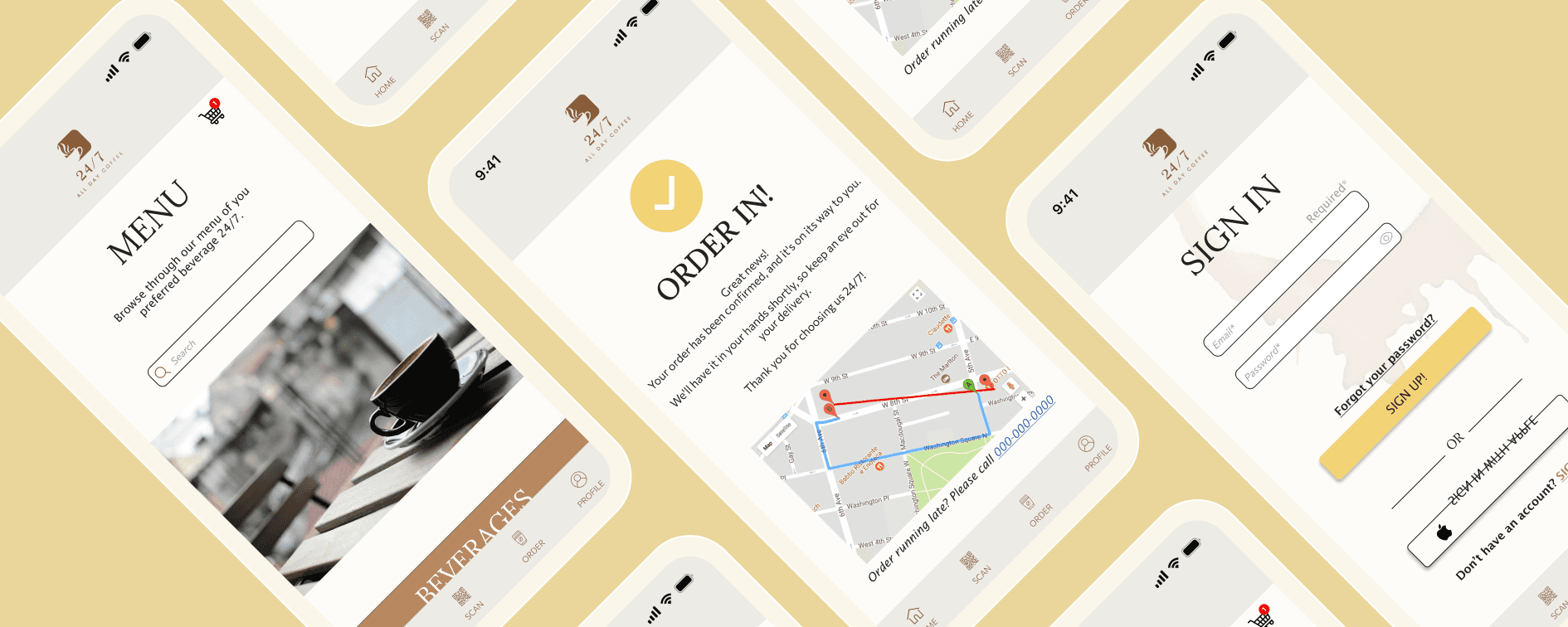
24/7, your always-open neighborhood coffee shop, is loved for its flexibility. To make it even more convenient, the owners are introducing a mobile app, letting customers order their favorite coffee with a simple tap.
Prompt: 'Design a food ordering app'
Responsibilites
Role: UX, UI Designer
Project Duration: ~ 3 months
Tools: Figma
Conducting interviews
Paper and digital wireframing
Lo/Hi fidelity prototyping
Conducting usability studies
Making provisions on accessibility
Iterating on designs
The Problem
24/7 is a coffee shop in the heart of New York City, surrounded by college students, office workers, families, and tourists. Being open 24/7 is a lifesaver for the community, but with so many people flocking in, those high-demand rush hours can get a little overwhelming—for both customers and staff!
How can we make the ordering process at 24/7 easier and faster during those crazy rush hours, so customers and staff can have a smoother experience
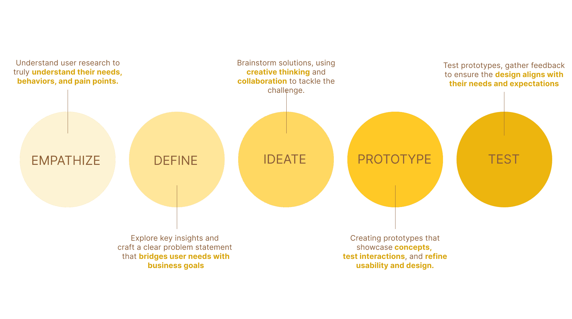
Process
Competitive Analysis
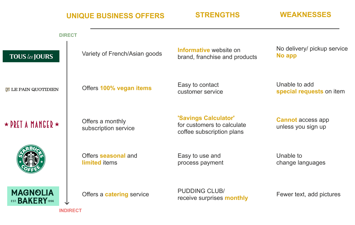
I learned that:
1. Most applications offers a reward system designed to encourage customer loyalty and support repeat business.
2. Having the opportunity to schedule order ahead improves flexibility for customers.
3. Seasonal items can drive a significant increase in intrinsic seasonality.
Customers' Values
According to a WGRZ poll over 40% of New Yorkers drink coffee every day, and 60% of coffee drinkers have more than one cup per day. To most New Yorkers, gulping down coffee is part of their quick-paced life style.
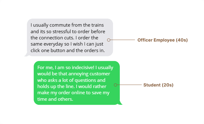
As someone who has transitioned from student to working adult in the city, I've noticed many people arriving late to classes or work because they’re stuck in long lines for a drink. It’s clear that fast, efficient service is crucial for customers who need to get their orders quickly.
Easy Accessible Homepage
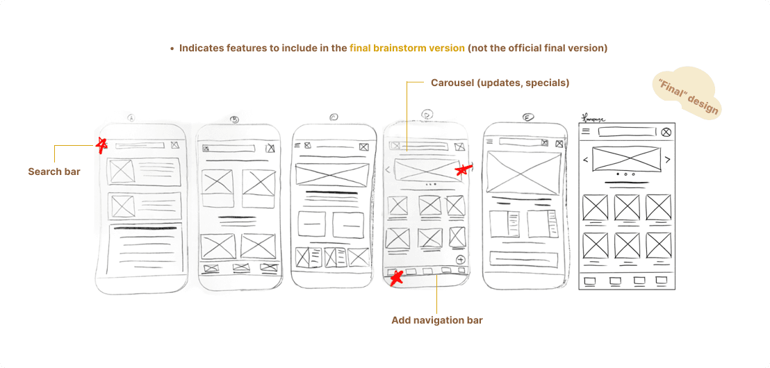
The homepage is the first thing users see, so it should be clear, welcoming, and easy to navigate. I focused on key features that help users quickly find what they need, especially when they’re in a hurry.
I sketched out some designs to achieve to help customers quickly make their orders and get on with their day.

Key elements for the homepage:
Branding & Logo: Clear and visible to establish identity.
Menu: Easy access to the full range of products.
Featured Products/Daily Specials: Highlight popular items to grab attention.
Quick Order Button: For fast reordering, perfect for busy customers.
CTA Buttons: Clear calls to action to guide users toward their goals.

What Went Wrong?
Through usability testing on my designs, I gained valuable insights into users' first impressions when interacting with my prototypes. Conducting two rounds of testing allowed me to identify areas for improvement and refine my designs effectively.
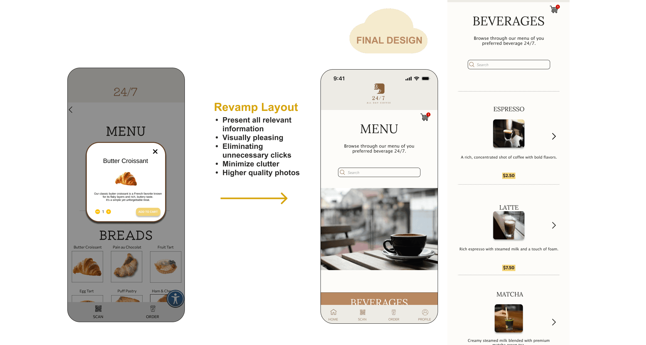
85% of users scrolled passed the menu without looking at it after 30 seconds.
"Wait, I thought this was just a photo gallery."
Some frustration in users after having to click through every item on the menu for pricing.

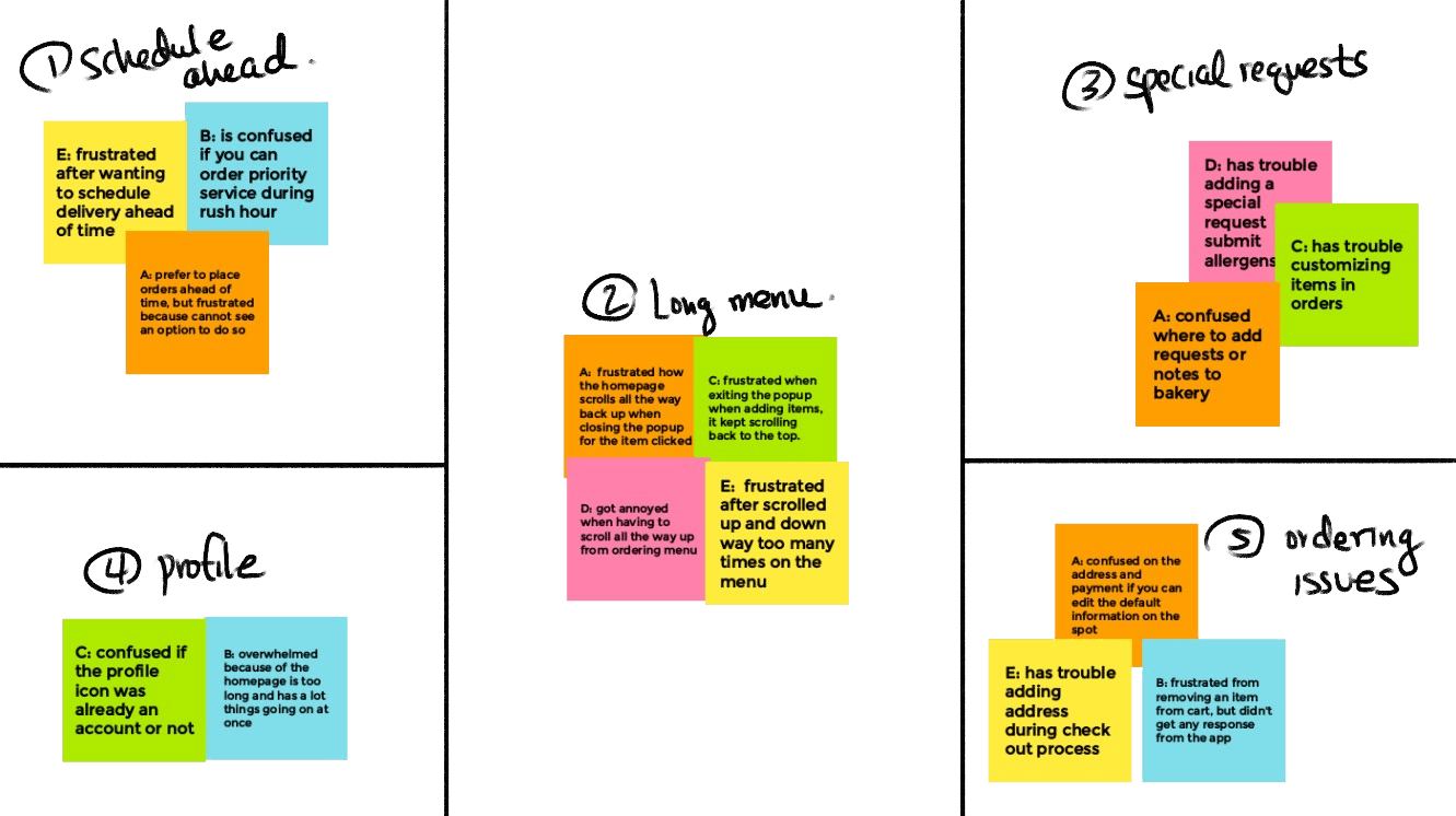
Affinity Map
Using the feedback I gathered from users, I organized their insights with an affinity map and developed a revamped layout.
Solution
Based on the research, iterations, testing, and user feedback, I developed a functional mobile app tailored for customers who value 24/7. Users praised the app for its aesthetic design, ease of use, and expressed enthusiasm about the rewards system and exclusive drinks.
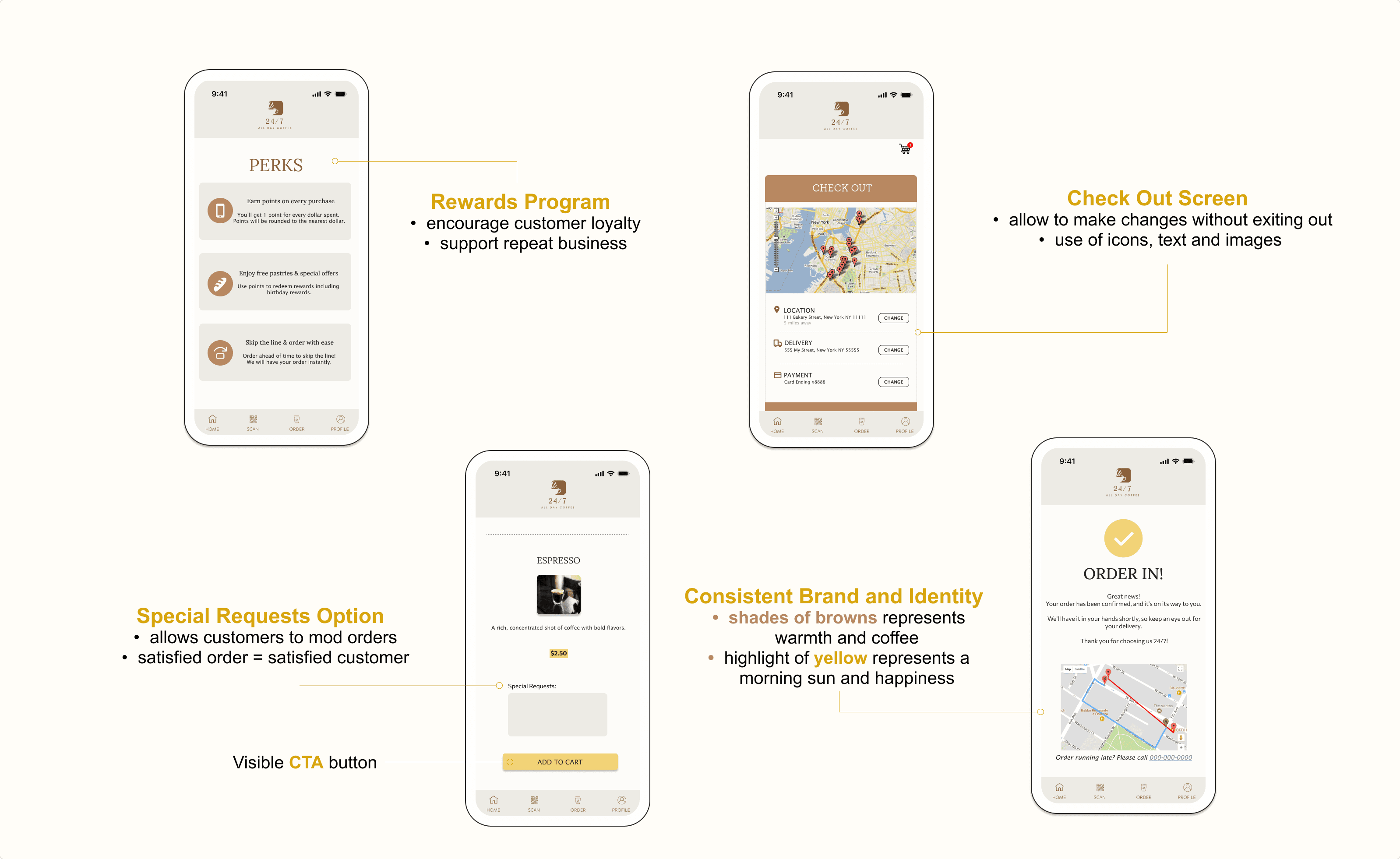

If this project is real, I'd aim to increase the conversion rate and decrease card abandonment during payment by by continuously iterating and incorporating user feedback. This approach would enhance the chances of customers completing their orders, ultimately driving higher revenue.
REFLECTIONS
Takeaways
For my future projects, I want to focus on better planning. This means doing thorough research, finding inspiration, and staying organized. Small details can make a big difference, so paying attention to them is key!
Personal Goals
Since this is my first project from Google Coursera, I realize there are countless resources available to help me improve my design skills and decision-making. Immersing myself in the world of design is essential for expanding my knowledge beyond the bootcamp.
What's Next?
Moving forward, we’ll test the app for a smooth user experience, incorporating user feedback to refine it.
Examine key performance indicators (KPIs) like drop-off rates and conversion rates.