Streamline Data Visualization
iShowroom
Overview
iShowroom is a desktop app from Citrix designed for salespeople in Interior Design showrooms. The Citrix Workspace app is the client-side tool that lets users securely access all Workspace apps, services, and data on any device or network. It provides access to files, mobile apps, and virtual apps through a single, easy-to-use interface.
Responsibilites
Role: Product Designer
Project Duration: ~ 1 month
Tools: Figma
Understanding user needs
Define Information Architecture
Focusing on Visual Hierarchy
Optimize for Data Visualization
The Problem
Citrix DaaS™ and Citrix® VDI often slow productivity due to issues like outages, slow logins, and frustrating latency. Additionally, the outdated 90s-style icons make the interface feel old-fashioned and less intuitive. As a sales employee, I want to design a modern, intuitive dashboard that addresses these challenges and better meets the needs of my colleagues.
Dashboards are the showroom for managing products.
Interface Limitations
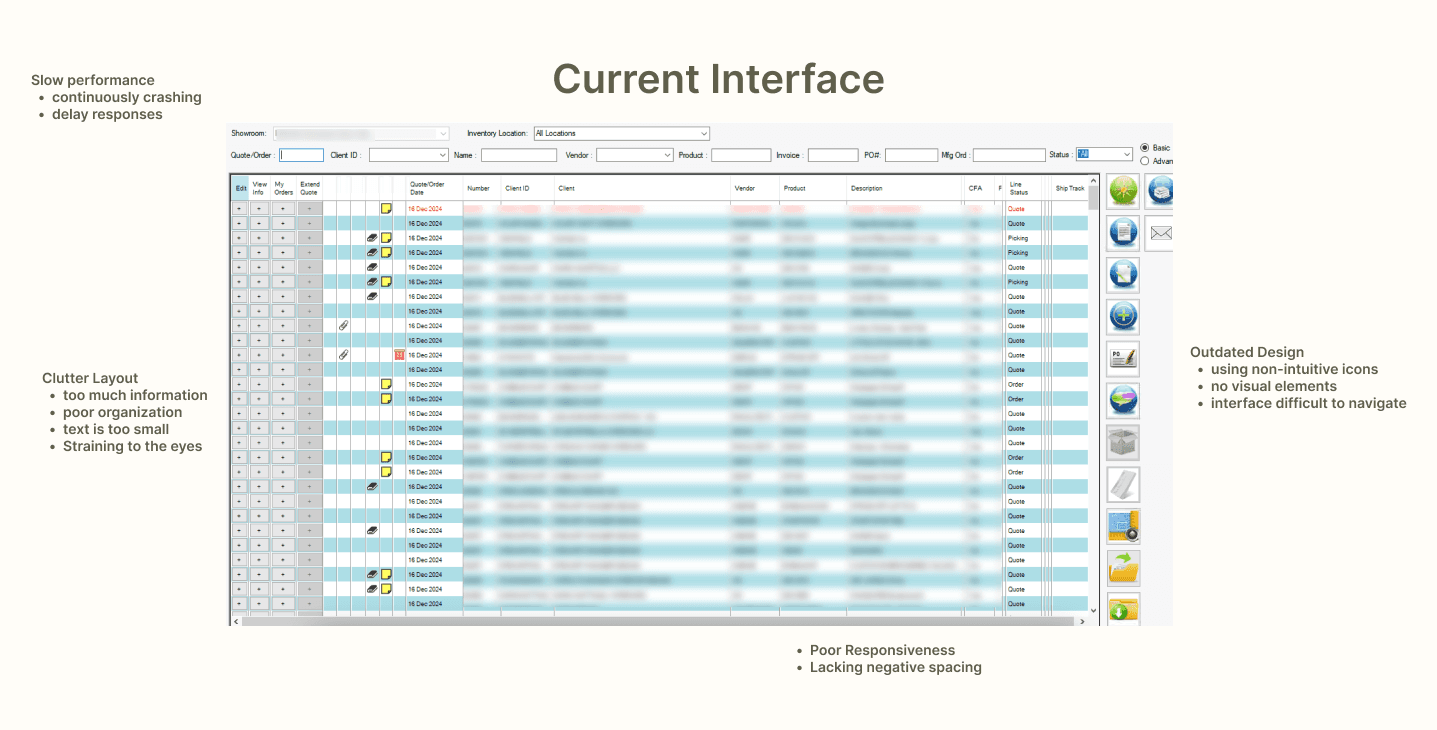
The current version of their pages had many issues. They are old and outdated, but that’s not the only problem.
Here are some of my observations:
It was visually cluttered.
Lack of hierarchy.
No proper filtration of information.
User flow was bad — lots of clicks and struggle to complete a task.
UI looks bad and out of place.
No feedback and improper messaging.
Affinity Mapping
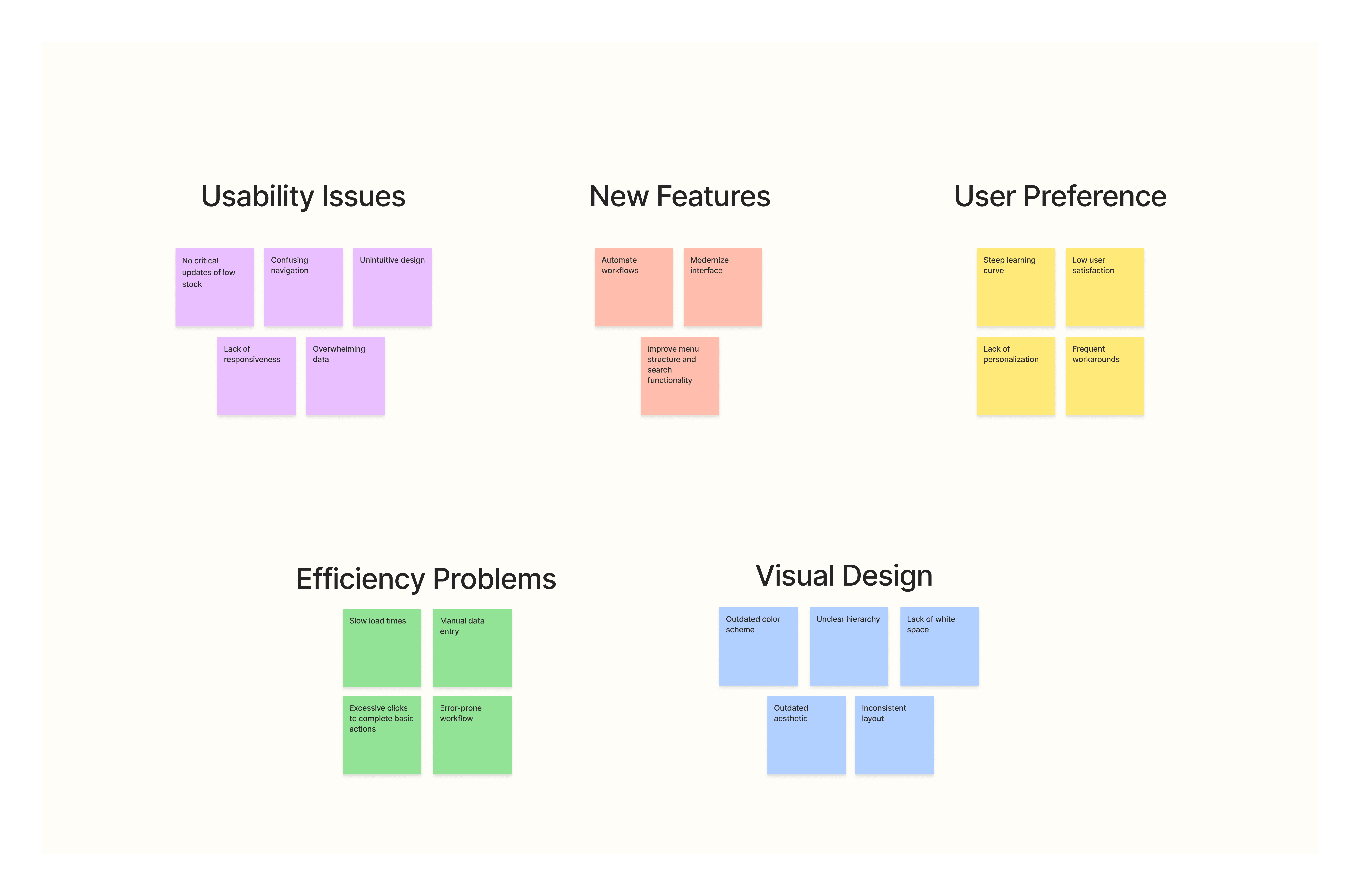
I wanted to gather feedback on the system from different departments. To do this, I spoke with staff from the sample department, sales representatives, and vendors in order to get a variety of perspectives.
The goals of this research were to:
Identify any areas of confusion in interacting with the dashboard
Understand where user needs are not being met
Determine if there are consistent patterns across all three departments
Information Architecture
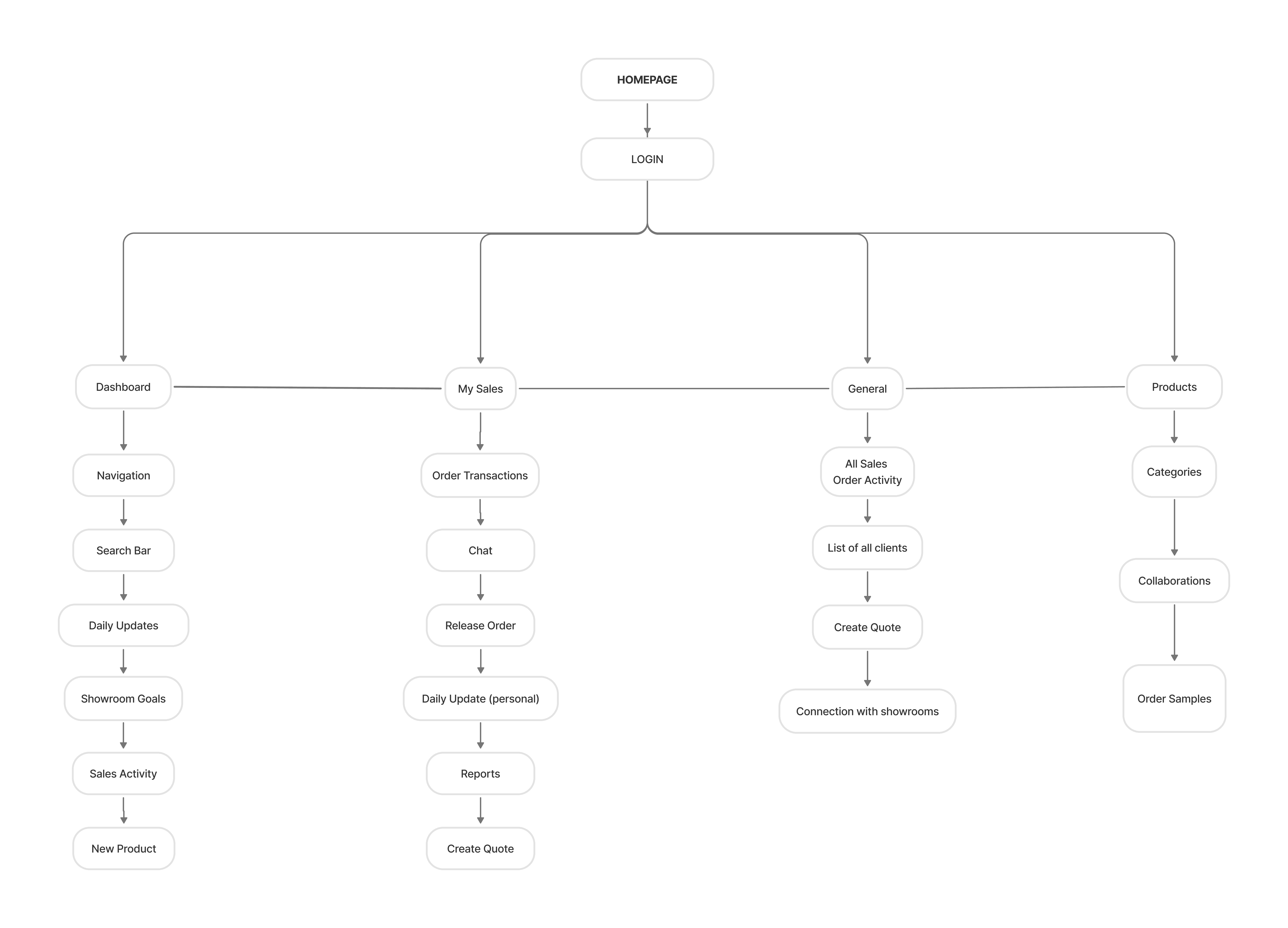
The current design of iShowroom was cluttered and disorganized, making navigation difficult for users. To address this, I began my design process by creating a blueprint to deconstruct the system.
Visual Hierarchy
Nothing stands out, making it difficult for users to determine which information is most important. Because of this there are lot of confusion and poor user experience.
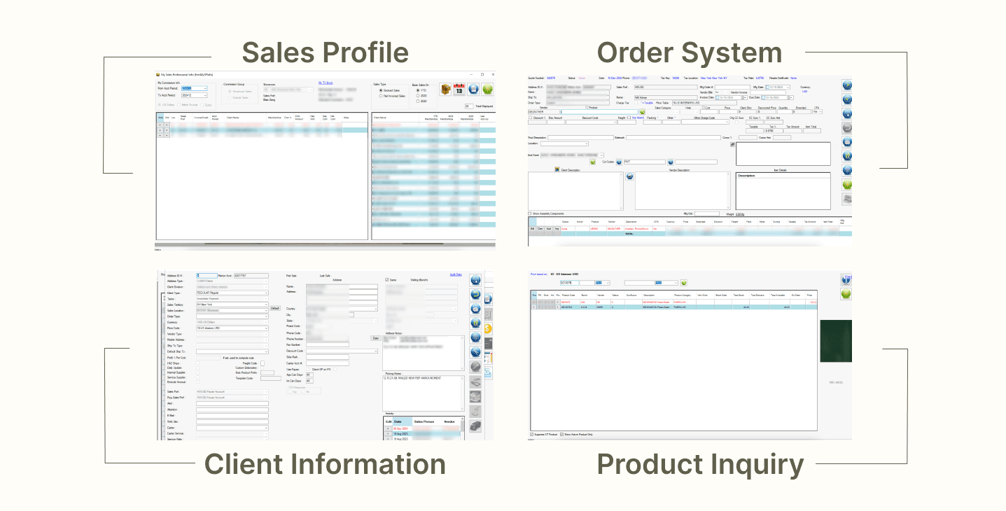
Scale: Without varying sizes to emphasize key elements, all content appears uniform and indistinct.
Color and contrast: The use of similar colors and low contrast makes it hard for users to identify important sections or actions.
Alignment: Misaligned elements create visual clutter and make it harder for users to navigate the interface.
Proximity: Related items aren’t grouped effectively, leading to confusion about their relationship and making it harder to understand the structure of the information.
Data Visualization
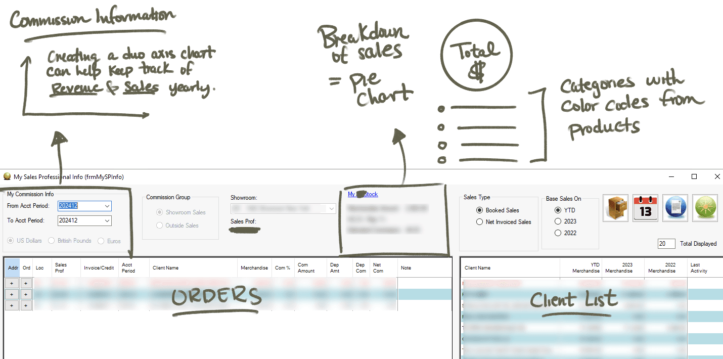
For dashboards with a lot of information, the presence of numerous numbers can quickly become overwhelming. The current iShowroom lacks visual elements, so I dedicated time to creating an intuitive way to group and organize the data by categories and themes, making it more approachable and easier to navigate.
Iterate, iterate, iterate
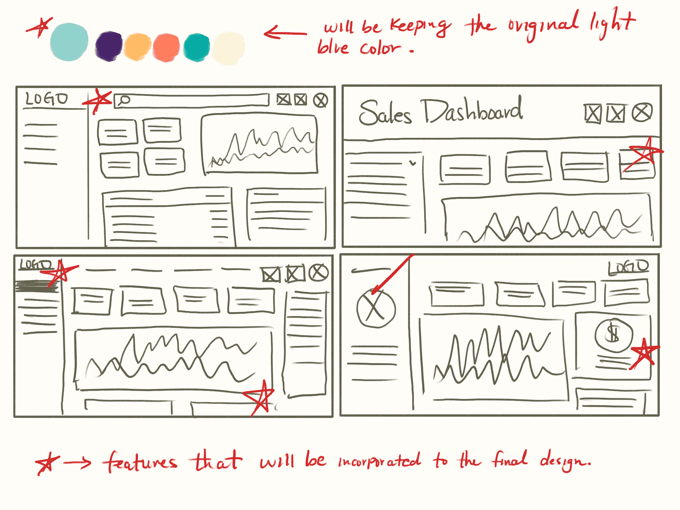
Designing a dashboard was challenging due to the abundance of information displayed on a single screen, which could easily become cluttered. To address this, I sketched various design options aimed at improving the existing layout and resolving the mentioned issues.
Official Design
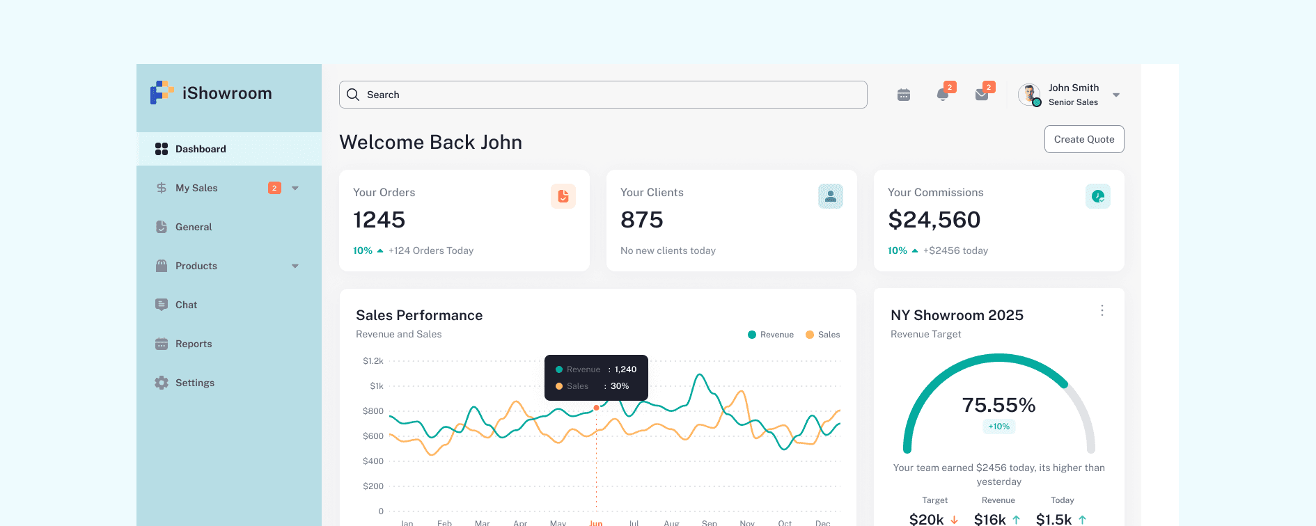
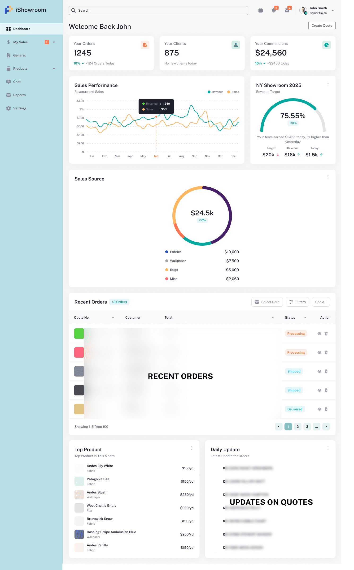
With feedback from both new hires and senior users with over 10 years of experience using iShowroom, I carefully designed a dashboard that is not only user-friendly but also generates excitement among its users.
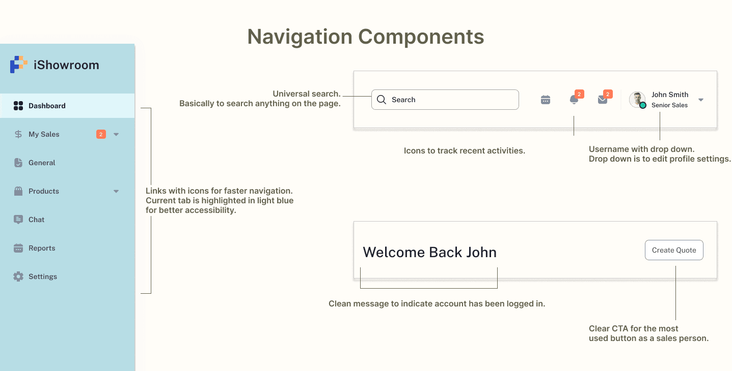
Breakdown of the dashboard
Used navigation elements because it makes it faster for users to reduce cognitive load and make faster navigation and also increase consistency throughout different pages.
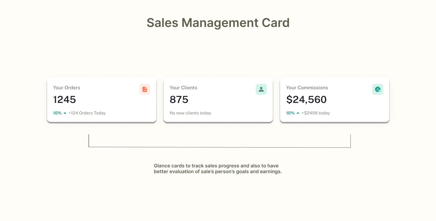
This card is for a quick glance placed on top that features all the statistical data which is useful for sales representatives.
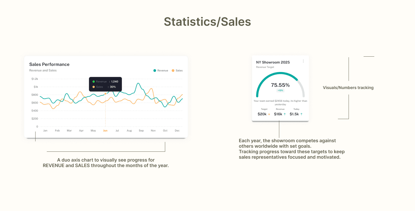
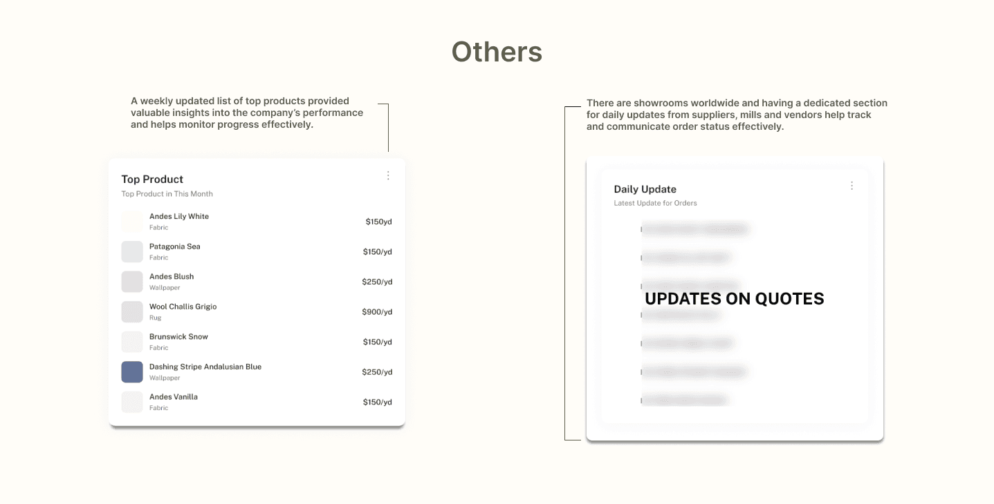
Having an overall visual of the data collected from the showroom will help keep track of the sales which eventually leads to better decision making and also to identify patterns.
Pie charts can be used to tell a story about data, highlighting specific aspects or emphasizing certain categories. It is visually appealing too.
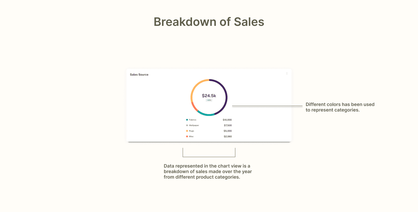
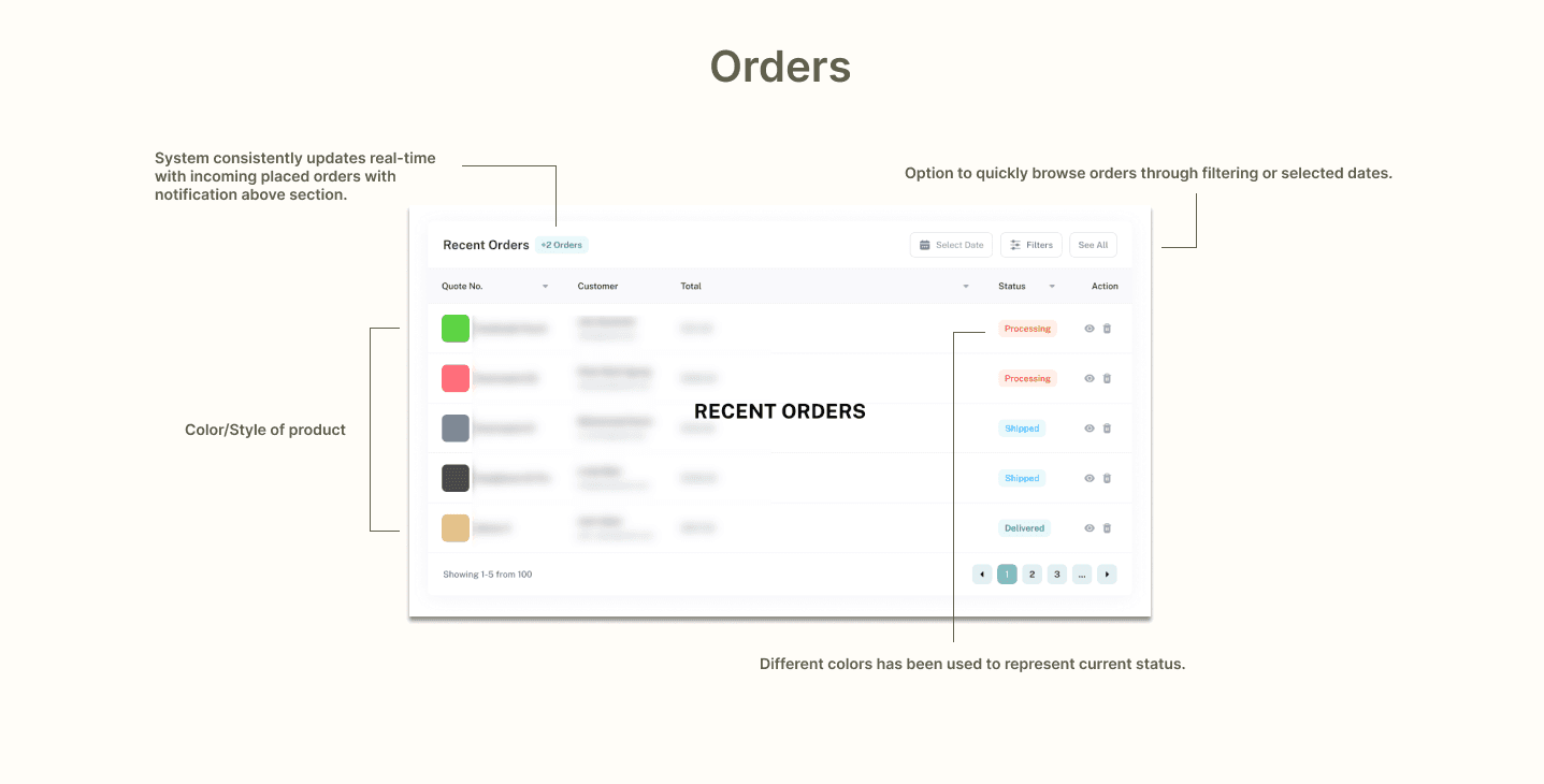
Table views provide an organized and structured way of presenting data, which can improve the overall user experience especially if there are colors, images and less text.
REFLECTIONS
User research was fun
There were many different types of users from various departments who used iShowroom, making it exciting to interview them and gather feedback on improving the system. I especially enjoyed seeing their reactions after testing out the dashboard.
Layout design
I learned how to prioritize information based on its importance and hierarchy. Designing a dashboard is very different from creating a website or mobile app. Dashboards focus on functionality and data visualization, using tools for filtering and interacting with data.
What's Next?
Monitor how different departments use the dashboard over time and collect insights for iterative improvements.
Ensure the dashboard meets WCAG standards to accommodate users with disabilities.